 I am super excited that Suzy Hutchinson agreed to join our super team of super judges for this year’s super Illustration West 59! (That’s a lot of supers!) Not only does she have a rich history of being an illustrator and graphic designer, but in her position today as MAD Magazine’s Art Director, she works on a daily basis with some of the top illustrators and cartoonists currently working in the business. She knows what is good, what is current, and where it all came from in the past.
I’m so pleased that we were able to talk together a bit about Suzy’s work as a designer on some very cool projects from the past in both the music biz and Disney, as well as getting into some shop talk regarding what it means to emulate old monster movie posters!
Of course, we also talked about her amazing work adding to the legacy at MAD that continues to bring humor to a woefully cynical world. Currently in its sixty-eighth year, we even chatted about where that humor magazine is headed in today’s trying times.
Please enjoy reading about this fascinating member of our Illustration West 59 judging panel that we hope will inspire you to keep illustrating your own look at life!
Chad Frye
Illustration West 59 Show Chair
First of all, you are unique on this year’s judging panel because not only are you an illustrator, but you attack it with the eye of a graphic designer because you ARE, in fact, also a graphic designer having worked for Disney, Dreamworks, Tooth and Nail Records, Warner Music Group, and presently with MAD Magazine. What drew you (pun intended) to the world of graphic design as an art form?
Illustration and graphic design have a lot of similar traits: composition, color scheme, and conveying a feeling or message to a particular audience. At the beginning of my career, I considered myself more of an illustrator, and was hired as such. Luckily, I also grew up in a very artistic household, with both my parents being incredibly talented artists and coincidentally, graphic designers as well. So from an early age, I was exposed to multiple disciplines in both fields, and they just sort of ran together naturally. My folks also taught me early on in the game, that paying the bills as a graphic designer is a bit more stable than as a full time illustrator. I have huge respect for all the talented illustrators and cartoonists who make a living solely on their work. It’s a really competitive field, and it takes tenacity, guts, and talent to make it in a professional way.

I also did a lot of poster and music design work early on, and have always loved the visual impact that a really well designed show poster, LP cover, or even CD packaging has when the graphics and illustration are combined well. And a lot of the poster work I did was screen printed, which in my mind is also an art form unto itself. Having worked in the music industry at a time when the opportunity to go a bit crazy budget-wise was really good training in how art and graphic design go hand-in-hand.
Unfortunately, like many things do, the music industry sort of imploded upon itself in the early to mid 2000s, but graphic design is pretty flexible as an occupation. So, I was able to become sort of a jack of all trades early on, having both illustration and design in my skill set. The computer age sort of knocked out having drawing skills as an asset to being a designer, but to me it is a crucial part of conveying design concepts and working out ideas.
With illustration integrated so fully into your designs, are you also often creating the illustrations yourself? Or are other illustrators working with you to accomplish what you are designing?
I wish I had more time to incorporate my illustration with the design. Occasionally I do get the chance, but my illustration skills have grown a bit rusty as of late. It takes a lot of discipline and daily practice to keep up with all of the excellent artists out there today. And while at MAD, art directing all of the incredible artists and cartoonists make me feel like a hack sometimes. I feel fortunate and privileged to be working with the best in the business.
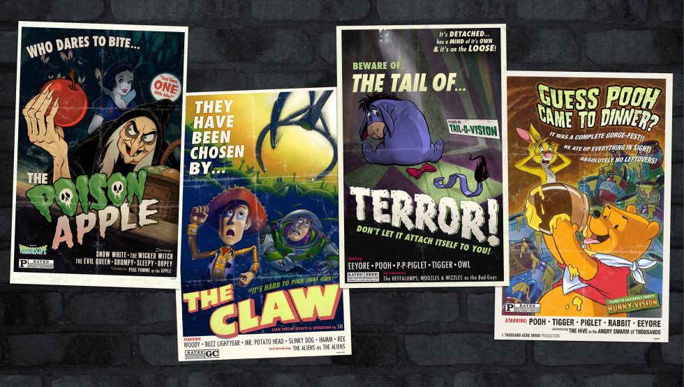
One of the projects you worked on was the promotional campaign for Disney’s Frankenweenie animated film. Having created the Illustration West 59 poster myself based on vintage monster movie posters, I absolutely loved those vintage-looking posters you created! Could you tell us a little about that project?
The Frankenweenie promotion was one of the last projects I worked on while at Disney Consumer Products. At that point in my stint at Disney, I had done a few projects taking some of the amazing archival art they have and creating new “B-movie” poster style graphics that fit with the retro trend of the time. Actually, that was my favorite part of working there, as you can imagine what a HUGE archive that is. The other “poster” style graphics had the classic Disney characters with vintage horror movie poster theme and editorial.
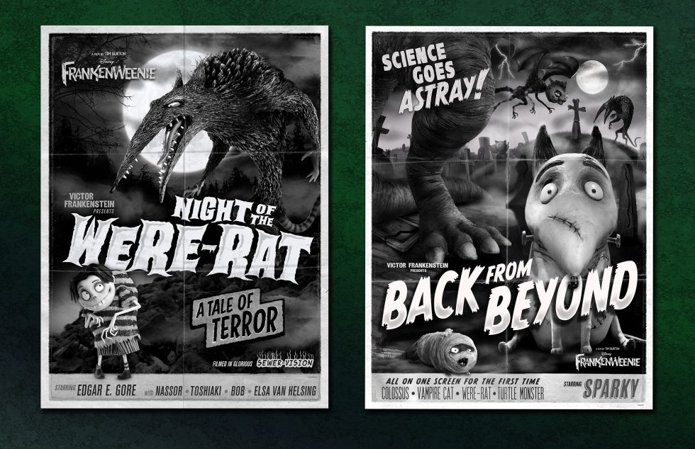
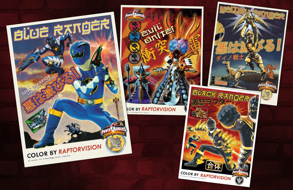
I also created some Power Rangers graphics that looked like vintage Godzilla posters too. Through those two projects, the project managers thought to assign the Frankenweenie project to me, to help make make the horror poster concept work and look authentic. I’m a huge Tim Burton fan, to get the opportunity on this was so exciting. Little did I know at the time that Tim Burton himself had to approve and sign off on all of these. I thought he was going to be super critical, but he liked them so much that he wanted me to create two new layouts, and I even wrote some of the schlocky editorial as well.
In fact, in looking at your body of work, you seem to be inspired often by vintage design motifs, while offering your own modern sensibilities to the work.
Thanks for noticing that aspect. I think most designers and artists look to the past for inspiration. And having the tombs of archives while at Disney was amazing! Taking their amazing old archival imagery and giving just enough of a modern, yet vintage twist is one of my favorite techniques. Trying to give it more of an illustrative feel adds to the story, and (hopefully) without adding in too much obvious “Photoshoppery,” the design feels more authentic to me – like it was some printed ephemeral treasure that you’d discover in a dusty cardboard box at a garage sale or thrift shop.
My obsession with vintage horror movie posters came into play as well. I love making a visual image that doesn’t look like it came directly out of a computer, and makes the viewer think twice that it might actually be vintage. I don’t think people realize how much work may have gone into the beauty of the hand done title treatments at the beginning of a classic old horror movie, or the quirky typeface from a quirky kids’ cereal box. Or how difficult it is to recreate that look without really studying the visuals of that item’s era to get the subtle nuances just right.
There is a bit of an art to making clean type look “bad” too. Learning how to properly break the design rules of leading and kerning in the classic sense to give the typeface just that little tweak to “vintage” them up takes some time to do right. It still fascinates me how those amazing old movie posters were produced at that time with manually typeset editorial, hand drawn logos, and the beautiful, bold illustrations. I don’t think younger designers really understand what it took to manufacture them, and how many of those standard techniques of the time have been lost to computer technology. I guess I’m dating myself a bit, but I also have a bit of an obsession with the history of graphic design too.
While your body of work is full of such compelling images in their completion, people don’t always realize that the artist/designer doesn’t always have autonomy when creating. You ARE working for clients after all, and clients always have notes, yet a graphic designer is usually hired to come in and present their ideas to accomplish the client’s goals. Can you speak for a moment about the designer/client relationship from your experience?
I’ve been lucky enough to have worked with some amazing clients and really good art directors, mostly during my freelance years. But also have worked with a number of bad ones too. Sometimes you have to be super flexible and check your ego at the door when you are doing graphic design work, but you also have to stand by your concepts and ideas as well.
I really hope that my experience working with both types of clients helps me to be a better art director and to understand the limitations when it comes to certain revisions. I try not to “noodle” too much with an illustrator’s work, but I do need to feed them a few to help with the overall layout and design of a page. And an illustrator sometimes isn’t thinking about how the type needs to fit or what kind of shape the editorial needs to fit in. If you feed someone too many noodles, sometimes a piece can get “too full” and lose some of the spontaneity of the original sketches and ideas.

With having created so many cool things, is there a project of yours that holds a special place in your heart?
Going way back to some of the early silk screened rock show posters I made in Seattle during the mid to late ‘90s makes me pretty nostalgic. It was a time in my career where the illustrations I did were more front and center, but I also had to work out the editorial and graphic layout aspects too. Everything was so low budget on those projects, too. It was never a money maker so I was really doing it out my love for that print format.
It was a challenge to make the posters work with just two or three colors. At that time I was still cutting all of the color separation films by hand with Amberlith, not getting film output digitally. This era of my career was when I was really transitioning over to using the computer for the graphics a lot more too. Not really because I wanted to, but out of necessity since the techniques of graphic design as a whole were becoming digital processes that became the industry standards. Talk about a lost art!
We recently pulled a bunch of old paste up boards from the MAD archives that Al Jaffee had worked on in the early MAD years. Amazing to see the artwork in that large format, and think about all the production that used to go into every single issue that we don’t even use anymore. Most of them still have the Amberlith overlays and all of the old graphic production notes on them. And the typeset editorial stuck on with rubber cement or wax. To be just old enough to have still learned those early design production techniques makes me feel a little bit more connected to the art departments and graphic production teams of the past. Not that I miss having those little orange scraps of film getting stuck everywhere!
 With such a legendary past of the publication, what was it like getting the call offering you the gig of becoming Art Director for the current MAD Magazine?
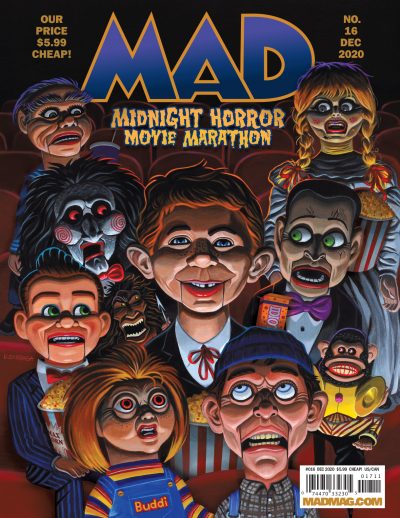
It was genuinely mind-blowing. When I got the call, I was up in Seattle visiting my folks and I had a bit of an anxiety attack about the whole idea of this being a reality. My dad was one of the first generation of MAD readers and a big fan since he was about twelve years old when the magazine started in 1952. I’m positive he was influenced by the artists and the overall madness of those first MAD comic books. And so was I since I regularly used to steal my big brother’s MAD Magazines and practiced drawing by trying to copy the amazing line work of some of the original “Usual Gang of Idiots” like Sergio Aragonès, Al Jaffee, Don Martin, and Mort Drucker. Also, being the first female art director of such an American humor magazine institution had me making sound effects like a classic Don Martin piece, needing to don a MAD straight jacket!
Coincidentally, right after the initial freak out, I went out for a walk in my old neighborhood to calm myself down, and I walked by my old house where I probably stole that first MAD from my brother. The hair stood up on the back of my neck thinking about me at that age! I would have NEVER thought in a thousand, million years that one day I’d be actually art directing a few of those surviving “idiots” like Al and Sergio. THAT was (and still kind of is) completely nuts to think about!!
Describe for us a typical day working at MAD.
I usually start my day by lacing myself into my big, purple clown shoes, hopping on my unicycle, grabbling my rubber chicken, and riding out of my office to go bonk my coworkers on the head. HA HA HA! Well….I really WISH it was like that, but a real typical day is really not super exciting. But it is truly exciting being able to work with and collaborate with some of the most talented cartoonists, humor writers, and illustrators in the biz. Also having some truly talented team members on the MAD staff makes me feel truly lucky to have this position.
 By the way, at least THREE of our other Illustration West 59 judges have been MAD cover artists in the past: Jason Seiler, C.F. Payne, and Drew Struzan!
YES! I noticed that too! While I’ve not had the pleasure to work with the truly top notch illustrators C.F. Payne or Drew Struzan, I have much admired their MAD cover art. Amazing work!
I was so privileged to work with Jason Seiler on one of the most disgustingly beautiful covers during my turn as art director. The concept was thought up by Michael Wartella, and I am so glad that Jason was available as he pulled off the bizarre idea of Alfred E. Neuman as his own uvula perfectly. I “fed” him quite a few “noodles” on this during the back and forth with the art direction notes. It was really a weird angle and was rather difficult to get the position just right. Jason added just enough spittle and super realistic detail to the final version. I think we really grossed out a LOT of people with this one, and MAD fans are pretty hard to gross out! We also got to use the tagline “The Uvula Gang of Idiots!” WHEN would THAT ever be possible again?!
 With MAD’s restructuring this past year, it seems as though there are still a lot of rumors about how the magazine is proceeding. Some say there’s no new material moving forward, some say there is new stuff coming. I’ve heard it’s not on newsstands/comic shops anymore, while others say it is – it’s all enough to straighten out Alfred E. Neuman’s eyes! It’s so confusing – can you set the record straight?
Yes…the year 2020 has created quite the huge amount of chaos for the entire planet and MAD, and the state of printed product in general. Hopefully Alfred and the world will have a vaccine and answers about the future soon. We need the parody and humor of MAD now more than ever. But a reorganization of this magnitude, during a company wide shutdown due to a world wide pandemic, it may take some time for the dust to settle. But Alfred and MAD are like cockroaches. They seem to survive through the traumatic times with humor.
We are thrilled to have you on SILA’s Illustration West 59 jury. After all the years of creating, what would the experienced Suzy Hutchinson of today tell her younger self who was contemplating entering this competition?
Ahhhhh..the younger me really needed to be told to stick to her gut, to trust her judgement, and to not get so overwhelmed by the process that it isn’t enjoyable. And to always have a rubber chicken on hand!
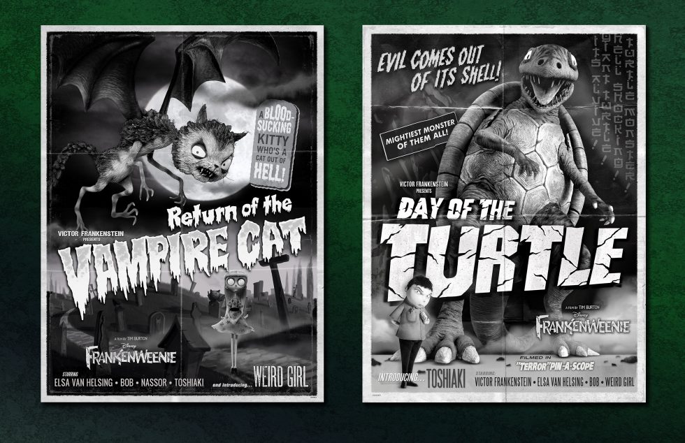
Illustration West 59 just EXTENDED our Call for Entries to November 14, 2020. Submit today so that Suzy can see your work! Details can be found at IllustrationWest.org!
All artwork ©2020 Suzy Hutchinson, not for re-use without permission of the artist.