 While Illustration West 59 accepts entries from around the world, our contest is based in Los Angeles. Also based in Los Angeles is our next judge to be interviewed, the incomparable Kadir Nelson.
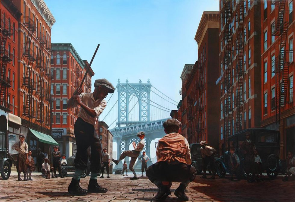
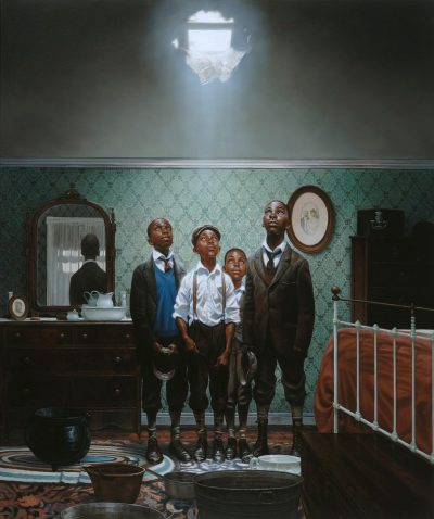
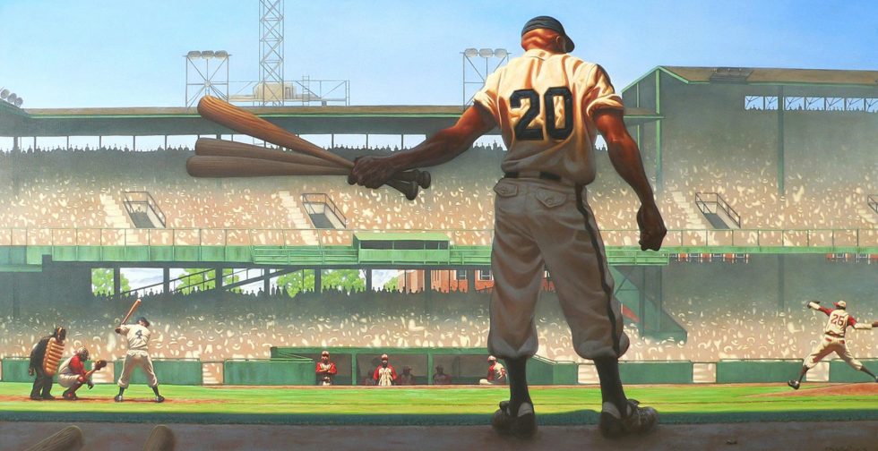
Kadir is the rare illustrator who seems to have a comfortable foothold in combined realms of children’s books, editorial illustration that is often of a serious nature, advertising art, and fine art. Just this year alone, you have seen his work on several covers of The New Yorker, National Geographic, and Rolling Stone, a painting commemorating the 100th anniversary of Negro League baseball worthy of a museum, and then this past week a painting was unveiled that he did to help advertise the upcoming season of the ABC network series black•ish.
With an artist of Kadir’s caliber and very busy schedule, we are honored that he has agreed to be a judge for this year’s Illustration West. I personally have been a longtime admirer of his work, perpetually amazed at the style and grace his paintings exude, and much to the benefit of the world, he is so prolific.
So, please enjoy this discussion with Kadir Nelson and just drink in the beauty and poignancy of what he creates.
Chad Frye
Illustration West 59 Show Chair
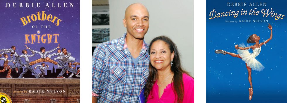
I first became aware of your work when I saw a talk that Debbie Allen did with John Lithgow at the LA Times Festival of Books many years ago at UCLA. She spoke so highly of your illustrations for her book Dancing In the Wings (Lithgow was talking about his book The Remarkable Farkle McBride illustrated by fellow Illustration West 59 judge C.F. Payne), and then the two of you did a signing together. However, this wasn’t your first time working with Ms. Allen, was it?
That’s correct. I met and worked with Debbie Allen on the film Amistad. We became fast friends, and once we finished work on the film, she asked me to illustrate Brothers of the Knight, our first book together.
You have illustrated so many beautiful children’s books over the years, even having been honored once with the Caldecott Medal, and receiving the Caldecott honor twice for your efforts. What is it about children’s books that keeps you excited about working on each new one that comes along?
I’m most interested in telling stories with my work. Picture books provide a wonderful platform to continue this practice; and as long as I choose subject matter that holds my interest and allows me to expand my knowledge, I’ll continue to illustrate them.

Whether images of humble situations, or of high society, you always imbue your subjects with a certain quiet dignity and strength. What is your philosophy in tackling a subject matter?
I create mages to inspire people to be their best selves, to remind them and myself of who we are and can be. I think that is one of the highest functions of art and creativity.

Your cover for Rolling Stone a few months ago depicting the recent social protests is modeled after the famous 1830 French painting Liberty Leading the People by Eugène Delacroix, and was such a striking image. What caused you to think of that painting for inspiration?
I feel Delacroix’s painting is the perfect embodiment of a revolution spearheaded by women. The BLM movement was, and is similar in that way, and American Uprising is a tribute to the founders of the movement and the army of protesters who have carried it forward.

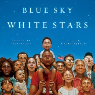
When I saw a photo of some of your We Are the Ship paintings, I was amazed at the huge size of your originals. They are so much larger than what most illustrators create for books. Then I saw an exhibit of your Blue Sky White Stars work in San Diego, and those paintings were much smaller. What is a determining factor in choosing the size of a painting?
The size of the physical artwork is dictated by the subject matter, the role of the artwork after it has been published, and most importantly, the amount of time I have to paint it. We Are the Ship took about seven years to finish. I had much less time to paint the art for Blue Sky White Stars, so the artwork is smaller.

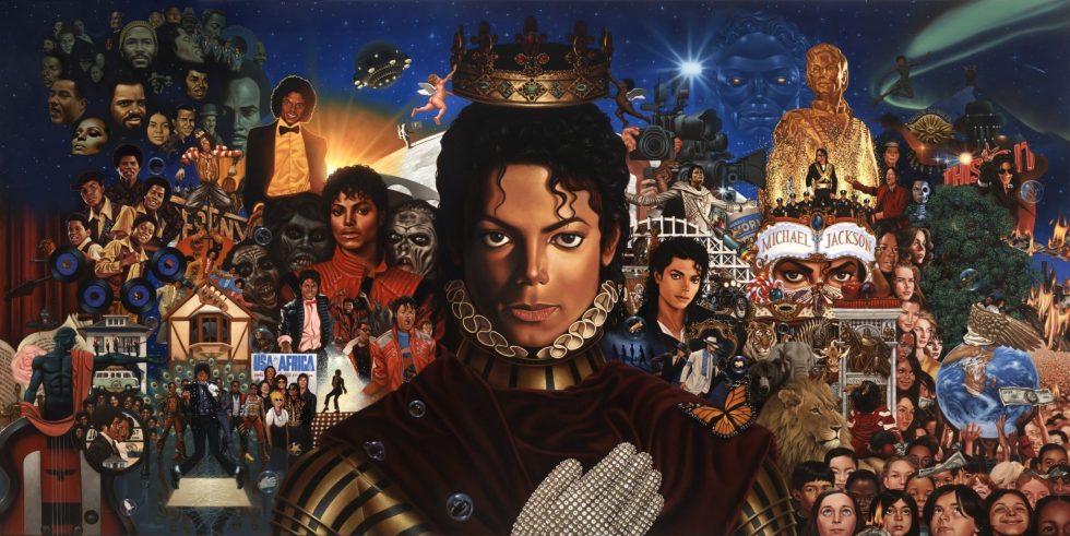
Speaking of large paintings, I remember seeing an embellished actual size print of your Michael Jackson album art at the Forest Lawn Museum in Glendale a couple of years ago, and was blown away by the sheer amount of work and skill that went into designing and painting that huge 9 x 4.5ft piece. Can you tell us a little about the behind-the-scenes of that painting?
For The King of Pop, although I was provided the title for the painting early on, most of the art direction happened after the painting was finished, mostly because we were unable to get approvals for some of the people other than Michael who were featured in the art. So unfortunately, I had to add and subtract portraits several times, both on the original painting and digitally. Although I’m proud of the final artwork, I still see things in the painting I’d like to change!
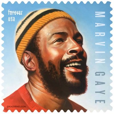
Having often worked quite large, do you find it challenging to create paintings for the United States Postal Service postage stamps when they require that the art can only be five times larger than reproduction size?
Likenesses can be a bit tricky for smaller surfaces, but it also takes a lot less time to paint smaller works. I prefer to work on larger surfaces most of all.

With work on music albums, magazines, stamps, books, movies, or anything else you’ve touched, has there been a project that has stood out from among the rest for you?
Some projects stand out a bit more for different reasons. We Are the Ship was special because it gave me maximum control of the project for both writing and painting, and it also allowed for wonderful experiences in the sports world. Painting the Michael Jackson cover allowed me to meet and interact with the Jackson family whom I grew up watching and admiring. The New Yorker covers allow me to reach large audiences, and have a voice in ways other platforms may not. The list goes on.

I hope you don’t mind me saying this, but while you are an illustrator, there is a fine art quality to your work that isn’t often seen in the work of many illustrators, evidenced by the fact that you have been in exhibits in many museums around the country including the Smithsonian’s National Portrait Gallery in Washington D.C.
While in school, I was introduced to the work of Thomas Blackshear who said once in an interview that he was a fine artist who painted illustrations. N.C. Wyeth, Norman Rockwell, and so many other illustrators during the golden age of illustration were also classically trained, and produced illustrative works that had a fine art quality. All of them heavily influenced my work and informed my mantra for creating illustrative and narrative works. I’m a painter and a storyteller.
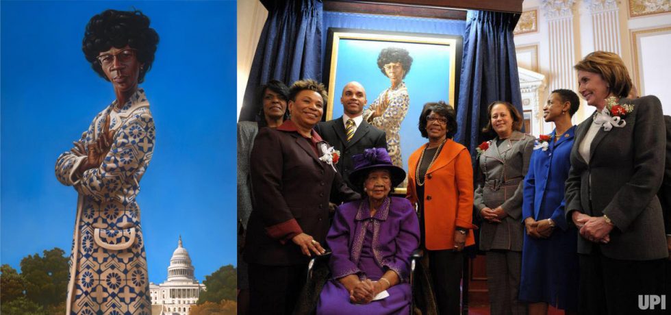
I love that you often post progression photos of working on your paintings on your social media accounts. I recall seeing shots of that recent National Geographic cover you did of slaves rowing in the longboat, and was struck by the fact that you painted the foreground elements first, which seems to fly in the face of what every painting instructor tells students – to paint from back to front. What led you to choose this method?
There are no rules for making art. After many years of painting, I ultimately learned that edge, color and value relationships are more important than painting from back to front. If you’re painting with acrylics, that rule works very well, but I find that working with oil allows for more versatility.

Thank you so much for being a part of our Illustration West jury this year, Kadir. Any words of encouragement you might have for those who are trying to decide what to enter in this year’s competition?
I recommend entering your best work, and enter as many competitions as you can every year. You never know how you’ll do unless you throw your hat into the ring!
