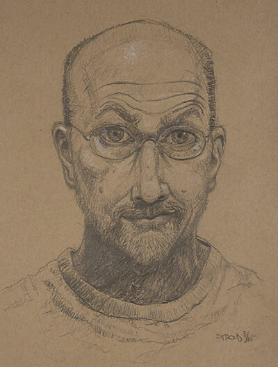
 As a freelance illustrator and designer I am mostly known for my editorial work. I studied in New York at School of Visual Arts under Will Eisner and Harvey Kurtsman earning my BFA, and at Fashion Institute of Technology where I received my MA degree. Working a combination of traditional and digital medium gives me the opportunity to exploit the advantages of both. My process is outlined below on one of the covers I did for Rubr.
At 13,000 words, 216 pages, Rubr is a completed graphic novel in a standard 5.5” by 8.5” format that I wrote, illustrated with traditional media, and typeset. Rubr was written for young adults who enjoy DC and Marvel but with a more sophisticated plot involving science instead of pure fantasy.
Along with freelancing I have enjoyed teaching at the college level for over twenty-five years. Classes included Digital Illustration, Anatomy, Photoshop, Life Drawing, Color Theory, and others.
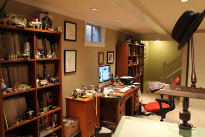
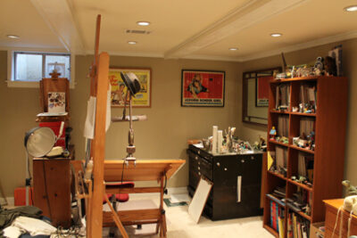
Please visit my website (jamiestroud.com) for samples of both my illustration work and graphic design.
Email me (jamieps@comcast.net) at your convenience with questions or to set up an interview. I look forward to hearing form you.
https://www.instagram.com/jamieinboulder
https://www.directoryofillustration.com/artist.aspx?AID=13812
Amazon
Jamie’s Cover Process
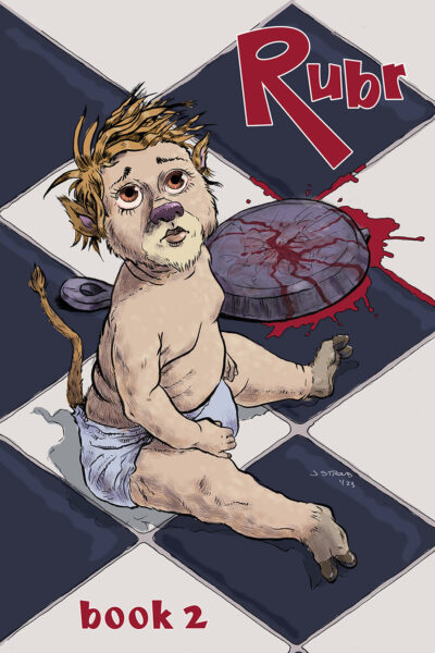 I start all my illustrations, and for that matter my design work, with pencil and paper. It gives me a freedom that the computer can sometimes hamper. After numerous thumbnails I work on a mockup about 50% of the finished piece. Next comes a tight pencil approximately 140% of the finished piece. Working this way allows me space for rendering in ink. Next comes my first scan, a monotone of just cyan similar to what a comic artist uses. I print this out onto Strathmore Smooth Surface, 100 lb bristol.
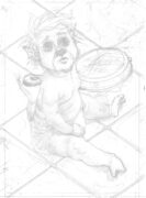
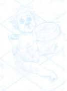
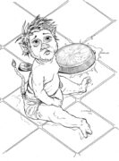 When inking I use permanent ink and a Windsor Newton Series 7, #0 and #00 brushes almost exclusively. However, sometimes I vary it with a broad #4 if I want a dry brush effect. For certain pages in Rubr such as the dream sequences (7 Stroud Rubr Pg 153), I use the tight pencil drawing and add charcoal as my finish.
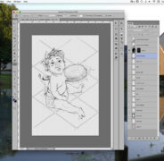
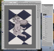
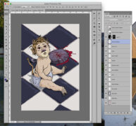
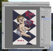
When the inking is completed and I wish to add color I scan the image and drop it into Photoshop. I learned a quick and easy process from my professor William Low at FIT where the ink layer is turned into a stencil with a transparent background. (*The directions are included below.) Working from back to front I build up layers in a way that let’s me make changes and corrections as needed without disturbing other areas.
For this cover I used a typeface I previously designed with some alterations. Once the work is completed I flatten it (always keeping the layered file for future use) reducing the size and keeping would be art assassins and critics from molesting the work. I am happy to make any changes they need, but of course prefer to do them myself rather than someone less familiar with my work. If you have any questions or comments please email me.
Jamie’s Samples
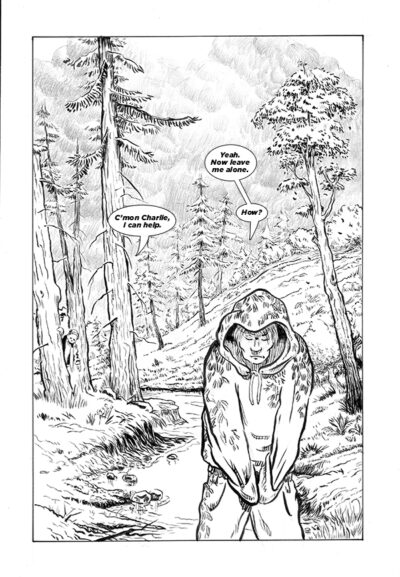
1 Stroud RUBR Pg 106
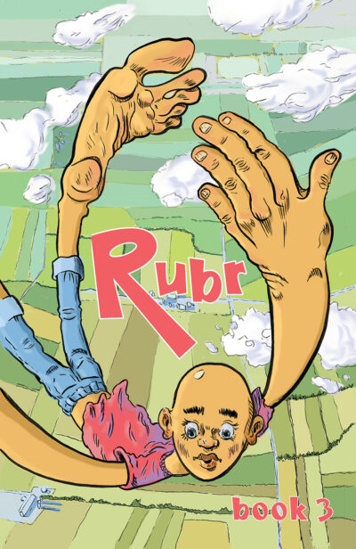
2 Stroud Rubr Cover 3
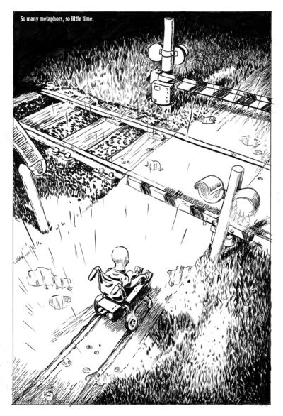
3 Stroud RUBR Pg 39
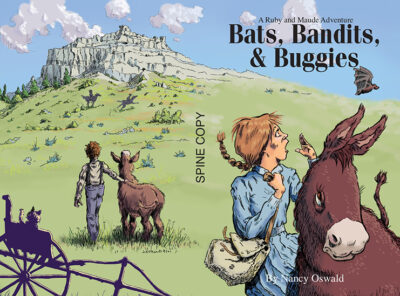
Layout 1
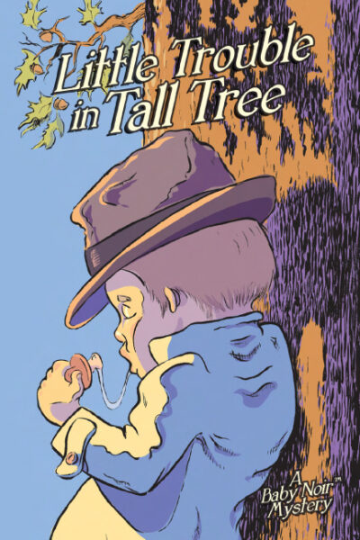
5 Stroud LTiTT cover
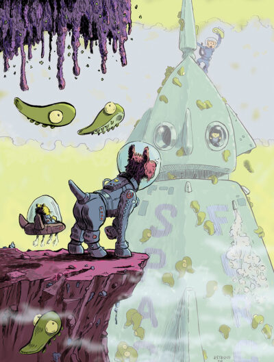
6 Stroud SF Space Fleas
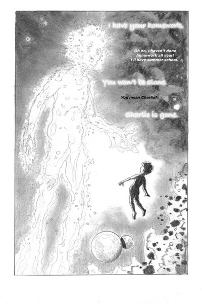
7 Stroud Rubr Pg 153
*Lows Instructions
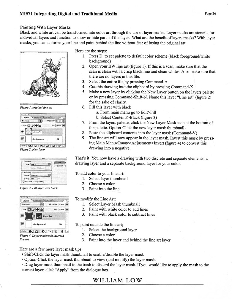
Low’s instructions
© no artwork displayed can be used without permission of the artist, Jamie Stroud.
